Scroll through Instagram or TikTok for five minutes and you’ll notice something: the profiles that catch your eye rarely have plain, boring bios. They’ve got bold letters, little symbols tucked between words, maybe some cursive-looking script that makes you stop and think, “wait, how did they do that?”
I get asked about this constantly, usually by people who assume it requires some kind of design software or a hidden Instagram feature. It doesn’t. The truth is way simpler, and honestly a little funny once you understand it: that fancy text isn’t a font at all.
Let’s break down exactly what’s going on, how you can do it yourself in under two minutes, and a few things worth knowing before you go wild with symbols.
Wait, Fonts on Instagram Aren’t Really “Fonts”
Here’s the part that trips people up. Apps like Instagram, TikTok, and Twitter (X) don’t let you pick from a font menu when writing your bio. There’s no dropdown, no settings toggle. So how do people get that bold, italic, or bubble-letter look?
They’re using Unicode characters.
Unicode is basically the massive library of characters that every device on earth agrees to recognize, it’s what lets an emoji you send from an iPhone show up correctly on someone’s Android phone. Buried inside that library are entire alternate alphabets that look like styled versions of our regular letters but are technically their own distinct symbols. So when you see “𝐁𝐨𝐥𝐝 𝐓𝐞𝐱𝐭” in someone’s bio, you’re not looking at bold formatting; you’re looking at a completely different set of letter-shaped characters that happen to resemble bold font.
Since these are just characters (like how “A” and “5” are characters), you can copy and paste them anywhere text is accepted, including bio fields that don’t support actual font styling. That’s the whole trick.
The Easiest Way: Fancy Text Generators
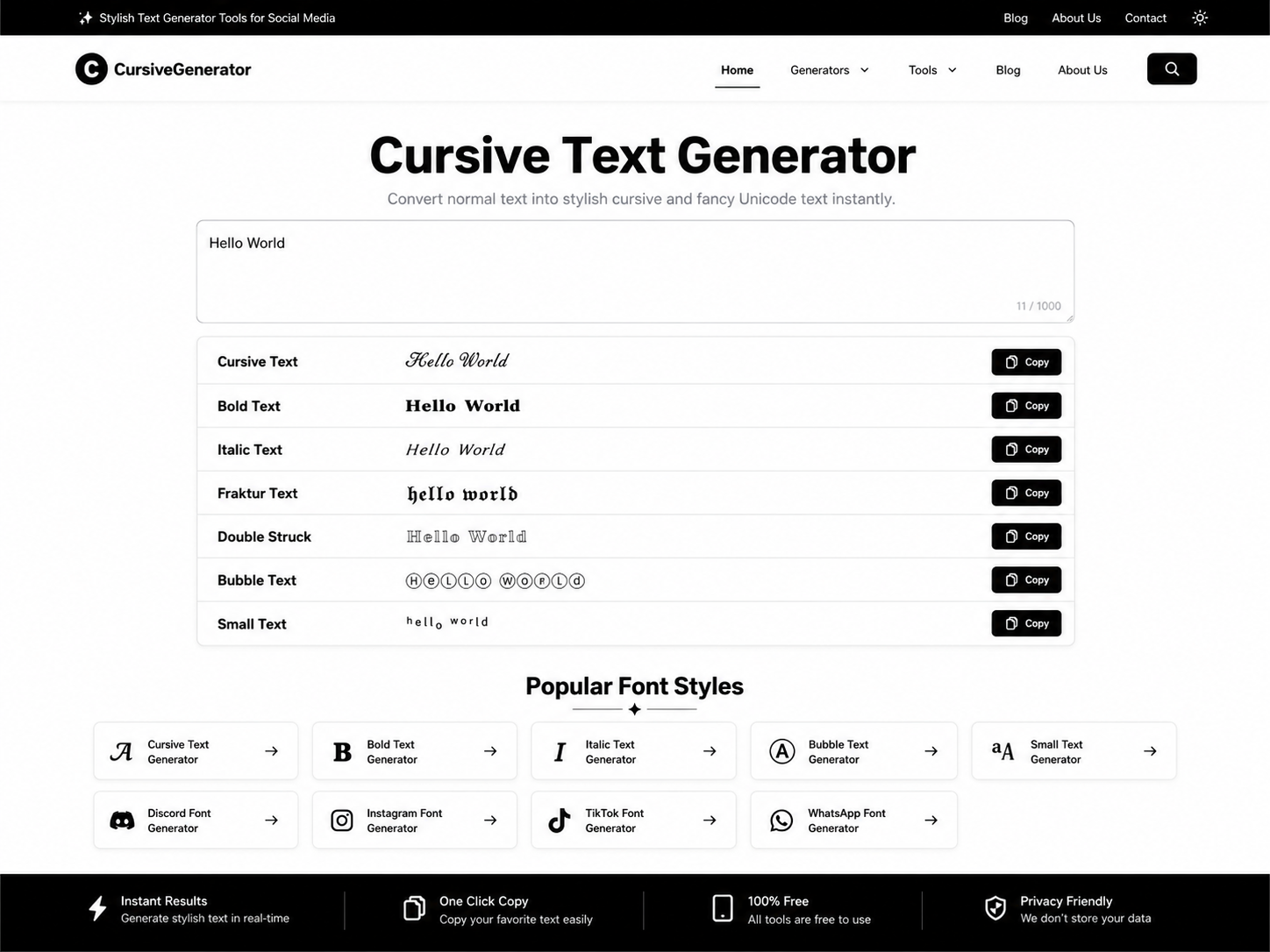
You don’t need to memorize Unicode codes or dig through character maps. Fancy text generator websites do the conversion for you instantly. The process is basically the same everywhere:
- Type your normal text into the input box (like “Sarah | Photographer 📸”).
- The tool instantly shows you dozens of styled versions, bold, italic, bubble letters, strikethrough, gothic script, upside-down text, and more.
- Click the style you like, hit copy.
- Paste it directly into your bio field.
That’s it. No download, no login, no design skill required. Popular tools like our pro text generator all work this way, and honestly, most of them are near-identical under the hood since they’re pulling from the same Unicode character sets.
A quick tip from experience: always paste your styled text somewhere neutral first, like a Notes app, before dropping it into your bio. Some platforms strip out certain Unicode ranges, and you don’t want to save changes only to find half your carefully chosen symbols vanished.
What Kind of Styles Can You Actually Get?
The variety is bigger than most people expect. Here’s a rundown of what you’ll typically find on any decent generator:
- Bold and italic serif/sans-serif – clean, professional-looking, great for business or creator bios
- Bubble text – rounded, playful letters that work well for lifestyle or fashion accounts
- Square text – boxed-in characters, gives a modern, edgy feel
- Gothic/Old English script – dramatic, often used for aesthetic or moody profiles
- Cursive/script fonts – elegant, popular for beauty and wellness bios
- Strikethrough and underline – useful for a “before/after” effect on a word or phrase
- Upside-down text – more novelty than practical, but people love it for a laugh
- Small caps and superscript – subtle way to add hierarchy without shouting
Mixing two styles (like a bold name followed by an italic tagline) tends to look more intentional than using a single style throughout the bio. It reads as designed rather than random.
Symbols, Dividers, and Spacing: The Underrated Details
Fancy letters get all the attention, but the small decorative symbols people scatter through their bios matter just as much for a polished look. Things like:
- Dividers: ⋆ ˚。⋆ ° ✧ ⋆。 ⁺ ˚
- Bullets and separators: • | ~ ⋮
- Arrows and accents: ➤ ↳ ➳
- Simple shapes: ◆ ▹ ✦
These come from the exact same Unicode source, and most fancy text generators include a symbol picker alongside the text converter. Used sparingly, they help break up multi-line bios so each piece of information (name, niche, location, contact link) feels like its own little section instead of a wall of text.
The mistake I see most often is overcrowding. A bio with five different font styles and ten symbols stops looking creative and starts looking cluttered. Pick one or two styling choices and stay consistent, your bio should feel curated, not chaotic.
Does Fancy Text Affect Your Reach or Searchability?
This is worth addressing honestly, because it’s a real concern and the answer isn’t a simple yes or no.
Since Unicode “fancy” characters are technically different symbols than standard letters, some platforms’ search algorithms may not always match them the same way regular text is matched. If someone searches your exact name in standard letters, a heavily styled version might not surface as reliably. For that reason, a lot of creators use fancy styling for personality-driven parts of their bio (a tagline, an emoji-decorated phrase) while keeping their actual username and core keywords in plain text.
It’s also worth knowing that screen readers, which visually impaired users rely on, often can’t interpret Unicode-styled letters correctly they may read them out as a string of nonsense or skip them entirely. If accessibility matters to your brand (and honestly, it should), keep critical information like your name or business type in normal text, and save the fancy styling for accents around it.
A Few Real-World Bio Examples
To make this less abstract, here’s how the styling actually comes together in practice:
Fitness coach: 𝐉𝐄𝐒𝐒 𝐌𝐈𝐋𝐋𝐄𝐑 ↳ certified trainer ⋆ nutrition tips daily 📍 Austin, TX
Small business: 𝒮𝓌𝑒𝑒𝓉 𝒫𝑒𝓉𝒶𝓁 𝒞𝒶𝓃𝒹𝓁𝑒𝓈 handmade soy candles ✧ shipped nationwide new drop every friday
Personal/aesthetic account: ✦ 𝘭𝘦𝘢𝘩 ✦ overthinker, tea enthusiast, chronic doodler 𝑙𝑖𝑣𝑖𝑛𝑔 𝑓𝑜𝑟 𝑡ℎ𝑒 𝑙𝑖𝑡𝑡𝑙𝑒 𝑡ℎ𝑖𝑛𝑔𝑠
Notice how in each case, only part of the bio is styled while informational details stay easy to read. That balance is what separates a bio that looks thoughtfully put together from one that looks like a novelty text generator threw up on it.
Step-by-Step: Setting Up Your Fancy Bio Right Now
If you want to actually do this instead of just reading about it, here’s the quick path:
- Open a fancy text generator (search “fancy text generator” and pick any well-reviewed one).
- Type your bio content in plain text first, exactly how you want it worded.
- Preview a few different style options, don’t just grab the first one.
- Copy your chosen style, paste it into a notes app to double-check it displays correctly.
- Add spacing or symbols between sections if your bio has multiple lines of info.
- Paste the final version into your actual bio field and save.
- Check how it renders on both a phone and desktop browser, since rendering can occasionally differ slightly between devices.
That last step matters more than people think. A style that looks perfect on your iPhone can occasionally render with missing characters on an older Android device, so a quick cross-check saves you an awkward surprise later.
Final Thoughts
Fancy bio text is one of those small details that quietly signals effort. It doesn’t take design skills or expensive apps, just a basic understanding of how Unicode characters work and a generator to do the heavy lifting. The key is restraint: pick a style that fits your brand’s vibe, keep your essential info readable, and use symbols to organize rather than decorate for decoration’s sake.
Once you’ve found a combination that feels like “you,” it takes about thirty seconds to update your bio whenever you want a refresh and that’s really the whole appeal. Low effort, high payoff, and a bio that finally looks as put-together as the rest of your profile.